Behind our Brand Identity
Shaped to Perfection
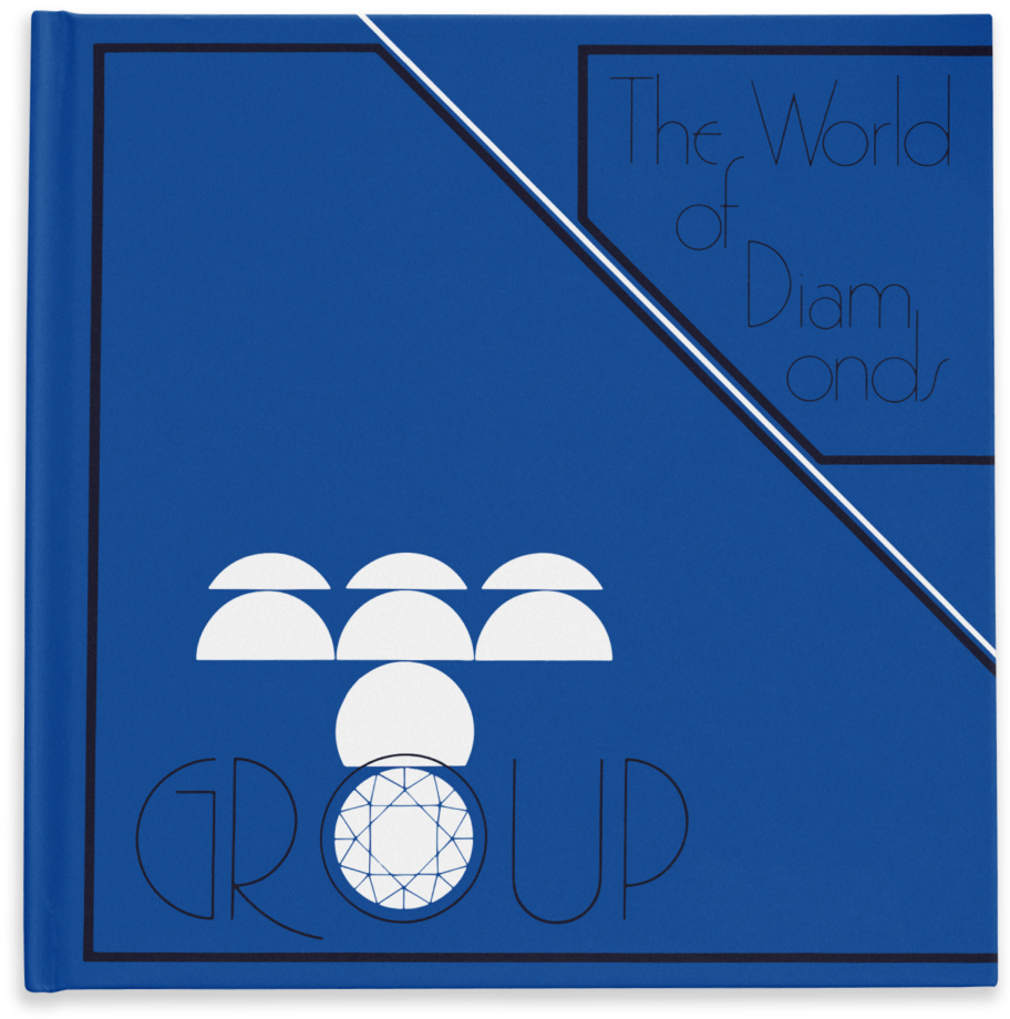
Designed in the 1960s, our logo stands as a timeless emblem that embodies our core identity. At its heart, it reflects our commitment to delivering quality. The rounded elements symbolise perfection and the evolving variation of those elements shows the craftsmanship infused into every facet.
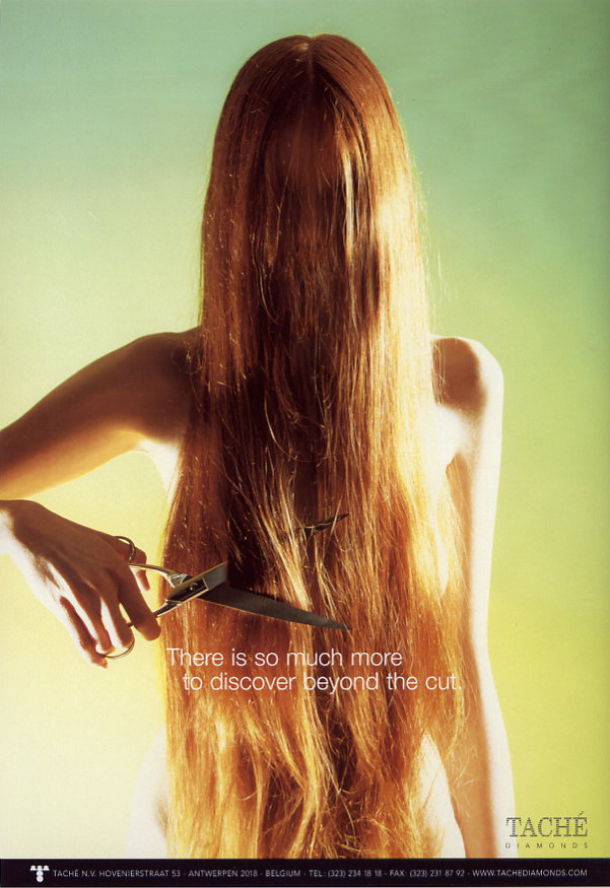
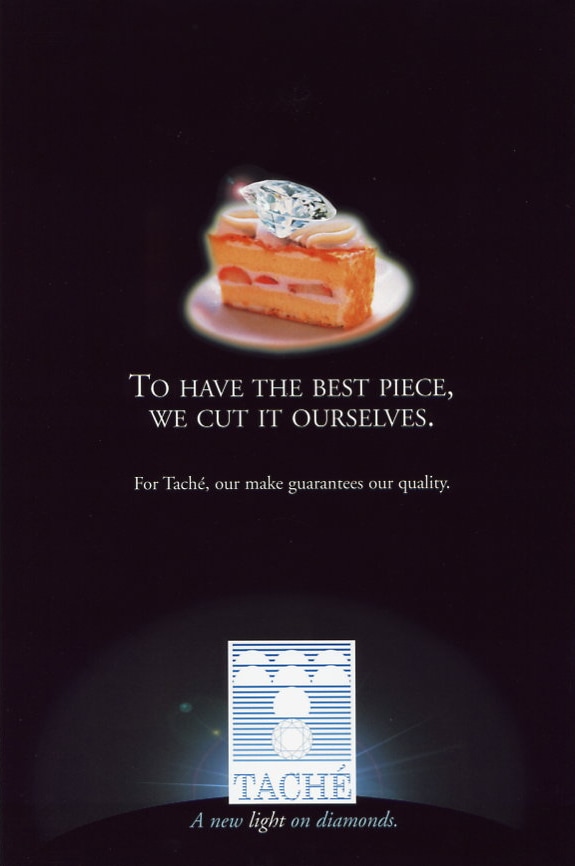
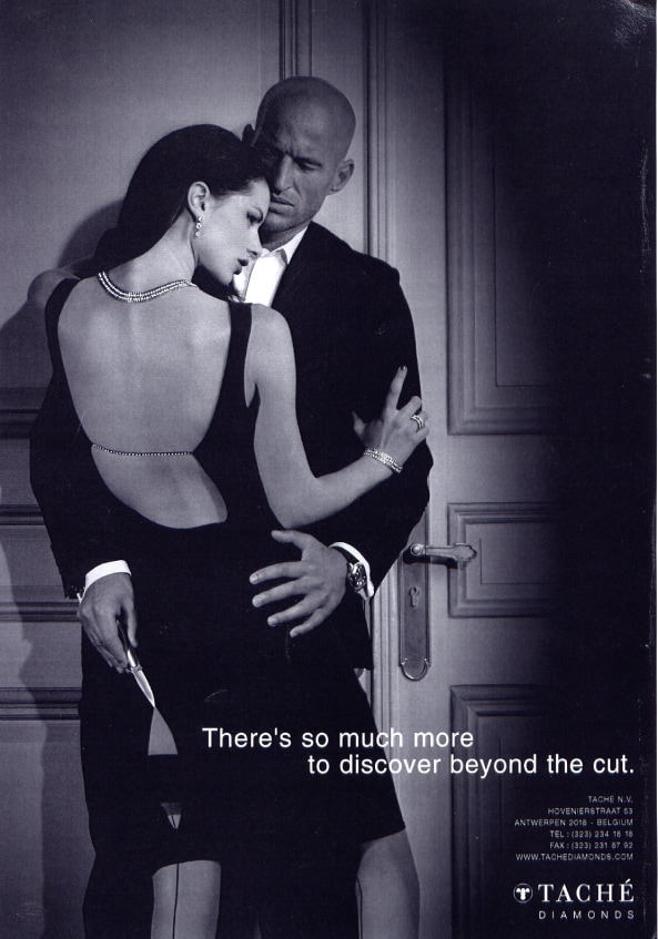
Cutting-edge
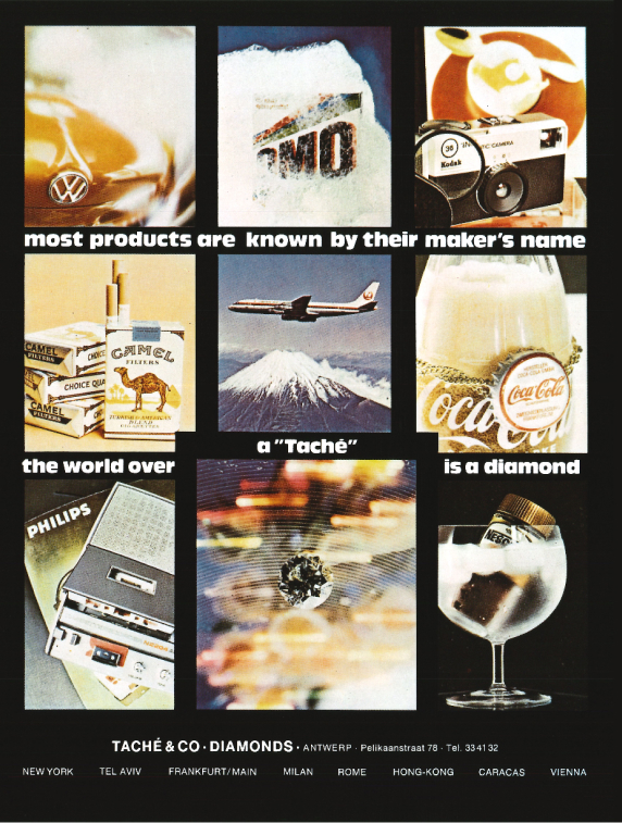
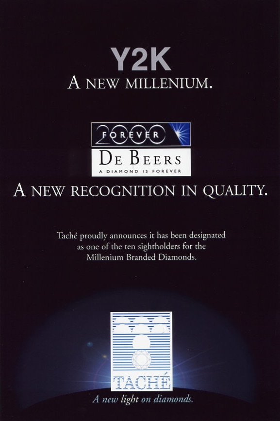
Back in the 1990s, our marketing campaign boldly declared “There is so much more to discover beyond the cuts” (of our diamonds). Today, this concept is still at the heart of our branding. We see ourselves as a cutting-edge player in the industry. One that offers unique solutions on top of a brilliant cut product only.
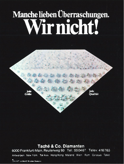


Brilliant Blue
Blue has been the defining colour of Taché from the very start, even gracing the pages of our vintage company books dating back to the early 1970s. It symbolises our youthful and innovative spirit that is deeply rooted in our heritage.